Afiniti Design System
 Home
Home

Role
Product Designer & Researcher
Why Do We Need A Design System?
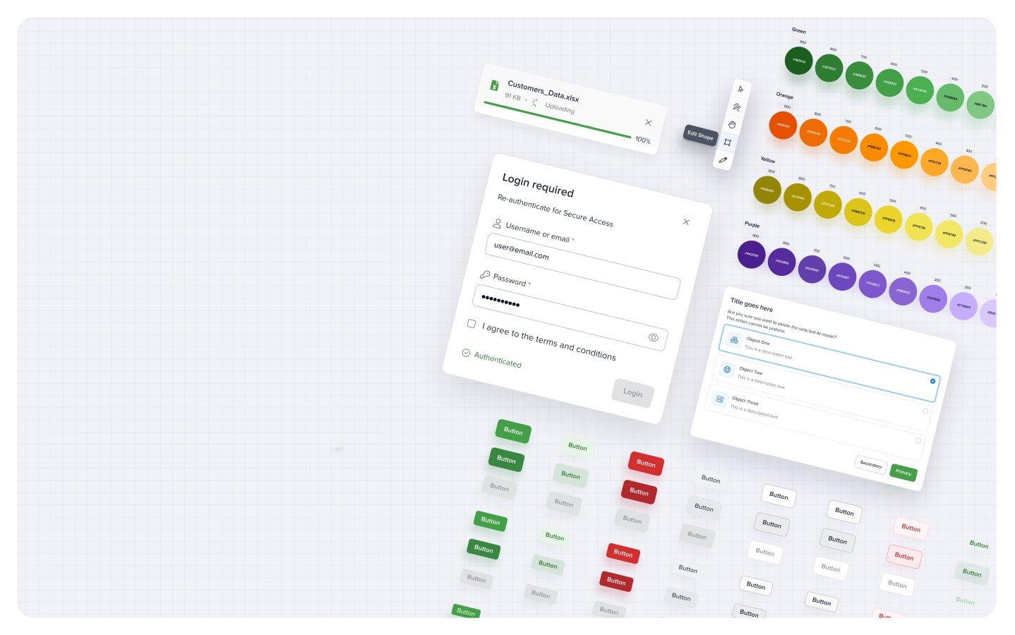
Afiniti observed inconsistencies across its digital products, leading to inefficiencies and a fragmented user experience. The absence of a unified design system was identified as the core issue.
Purpose & Context
I conducted UX audits to identify inconsistencies, collaborated with cross-functional teams to define design principles, developed a comprehensive UI component library, and established accessibility standards to ensure inclusivity.
Role & Responsibilities
As a Product Designer, I was tasked with developing a cohesive design system to unify Afiniti's digital interfaces, enhance efficiency, and improve user satisfaction.
Scope of Work and Sprint Timeline
All design sprint activities mapped across an 8–12 week timeline for a structured and efficient workflow.
Defining core design principles, creating a UI component library, establishing accessibility standards, and ensuring seamless design-to-development collaboration.

Empathize
Identify inconsistencies and user pain points in the existing UI.

Define
Establish design principles, accessibility standards, and goals.

Ideate
Conceptualize scalable components and UI patterns.

Prototype
Develop and refine reusable design system components.

Test
Validate usability, accessibility, and developer integration.
Phase 1: Research & Understand
What we learned:
- Inconsistencies in UI components across Afiniti’s products.
- Lack of standardized design guidelines causing inefficiencies.
- Collaboration gaps between design and development teams.
- Accessibility and scalability challenges in existing designs.
Activities conducted:
- UX Audit
- Stakeholder Interviews
- Competitive Analysis
- User Research
See the detailed process
Competitive Analysis
We analyzed leading design systems—Material (Google), Carbon (IBM), and Fluent (Microsoft)—to identify best practices.


Key Insights
- Comprehensive Component Libraries: These design systems offer extensive libraries of reusable components, ensuring consistency and efficiency across various platforms and applications.
- Robust Documentation: Detailed guidelines and best practices facilitate seamless implementation and maintenance, promoting a unified design language within organizations.
- Scalability: The modular nature of these systems allows for easy scaling and adaptation to diverse project requirements, enhancing flexibility.
- Accessibility Focus: Prioritizing inclusive design principles ensures that products are usable by a wide range of users, aligning with global accessibility standards.
By integrating these strategies, organizations can develop effective design systems that enhance user experience, streamline development processes, and maintain brand consistency across digital products.
Phase 2: Define & Develop
What we learned:
- Atomic Design Approach to create a scalable, reusable UI system.
- Design Tokens for consistency in colors, typography, spacing, and theming.
- Component Library with modular UI elements for efficiency.
- Figma Systemization for easy access and collaboration.
- Seamless Dev Handoff to ensure smooth implementation.
Activities conducted:
- Atomic Design Methodology
- Scalable Component Library
- Design Tokens
- Reusable Component Library
- Developer Handoff
Atomic Design Methodology
To build a scalable and reusable design system, we adopted Atomic Design—a methodology that structures UI elements into five hierarchical levels. This approach ensures consistency, efficiency, and flexibility in component creation, making it easier to design, maintain, and scale across products.
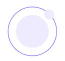 AtomsThe smallest building blocks
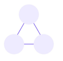 MoleculesGroups of atoms forming simple UI components
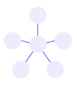 OrganismsComplex UI sections combining molecules
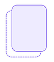 TemplatesLayout structures ensuring content consistency
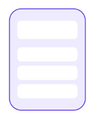 PagesFully designed screens using templates and components
Design Tokens
To maintain consistency, scalability, and efficiency, we implemented a Design Token system—a centralized set of values that define colors, typography, spacing, and more. These tokens ensure that UI components remain visually cohesive across products, platforms, and themes.
 Color SystemPrimary, secondary, neutral, and semantic colors.
 TypographyFont styles, sizes, and hierarchy for readability.
 Spacing & GridStandardized spacing units for layout consistency.
 Shadows & ElevationDepth effects for a clear visual hierarchy.
 Border RadiusCorner rounding
Color Primitives
Blue
- 900
- 800
- 700
- 600
- 500
- 400
- 300
- 200
- 100
- 50
- 20
Red
- 900
- 800
- 700
- 600
- 500
- 450
- 400
- 300
- 200
- 100
- 50
Green
- 900
- 800
- 700
- 600
- 500
- 400
- 300
- 200
- 100
- 50
- 20
Orange
- 900
- 800
- 700
- 600
- 500
- 400
- 300
- 200
- 100
- 50
- 20
Yellow
- 900
- 800
- 700
- 600
- 500
- 400
- 300
- 200
- 100
- 50
- 20
Purple
- 900
- 800
- 700
- 600
- 500
- 400
- 300
- 200
- 100
- 50
- 20
Cyan
- 900
- 800
- 700
- 600
- 500
- 400
- 300
- 200
- 100
- 50
- 20
Dim Black
- B-Notes
- B-Pumpkin 20
- B-Fern 20
- B-Charcoal 10
- B-Charcoal 20
- B-Ash 20
Brand
- 900
- 300
- 200
- 150
- 100
- 50
Obsidian
- 900
- 800
- 700
- 600
- 500
- 400
- 300
- 200
- 100
- 50
- 20
Dim
- Notes
- Pumpkin 20
- Fern 20
- Charcoal 10
- Charcoal 20
- Ash 20
Avatar
- Light Red
- Light Orange
- Light Pink
- Light Purple
- Light Cyan
- Light Green
- Light Yellow
- Light Blue
Black
- 900
- 800
- 750
- 700
- 650
- 600
- 500
- 450
- 400
- 300
- 200
- 150
- 100
- 50
- 20
Actions Primary
- 600
- 700
Typography
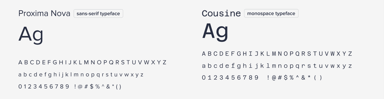
Proxima Nova Text Styles
Font size: 36px / 2.25remLine height: 44px / 2.75remTracking: -2%
Font size: 30px / 1.875remLine height: 38px / 2.375rem
Font size: 24px / 1.5remLine height: 32px / 2rem
Azeret Text Styles
Font size: 16px / 1remLine height: 11px / 0.75 remLetter spacing: -2%
Font size: 14px / 0.875 remLine height: 10px / 0.62 remLetter spacing: -2%
Font size: 12px / 0.75 remLine height: 8px / 0.5 remLetter spacing: -2%
Font size: 10px / 0.61remLine height: 8px / 0.5 remLetter spacing: -2%
Shadows
Elevation
- Outline
- Bottom Bar
- Bottom Bar 2
- Elevation 1
- Elevation 2
- Elevation 3
- Elevation 4
- Elevation 5
- Elevation 6
- Elevation 7
- Elevation 8
Notification Elevations
- Error
- Warning
- Info
- Success
Icons
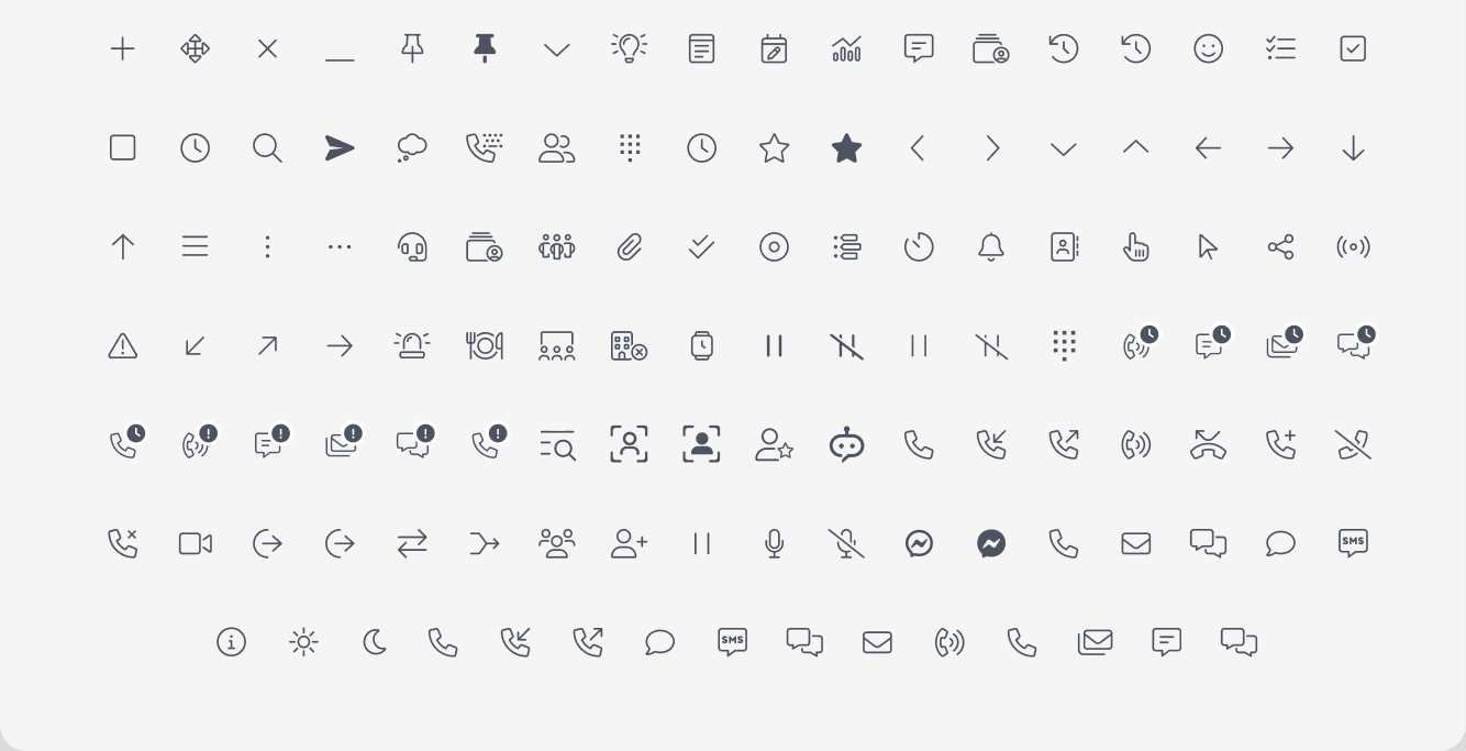
FontAwesome is a versatile icon library integrated into our design system to ensure consistency, scalability, and ease of use. With a vast collection of vector-based icons, it allows for seamless customization, including size, color, and positioning. Used across buttons, inputs, navigation, and feedback components, FontAwesome enhances visual clarity and user interaction.
Component Library
With Design Tokens in place, we built a scalable, reusable Component Library to ensure consistency, efficiency, and accessibility across all UI elements. This library serves as the single source of truth for designers and developers, reducing design debt and streamlining development.
Key Component Categories
Buttons
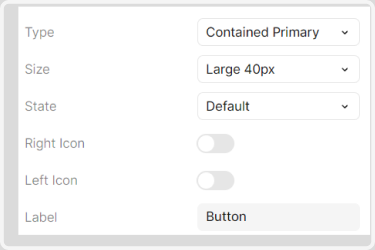
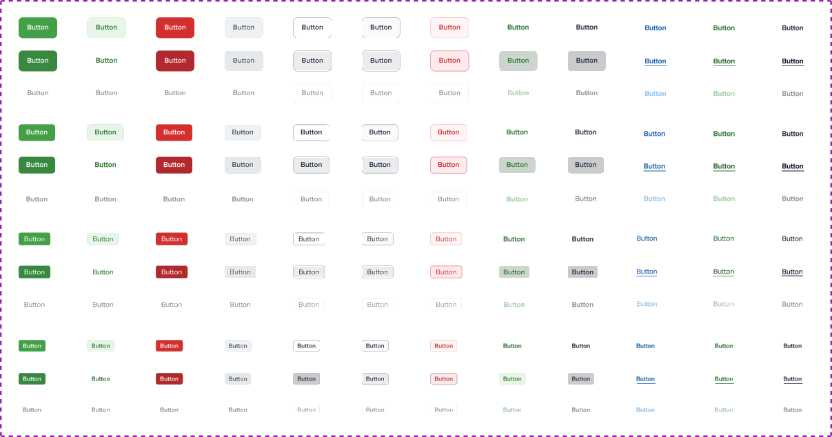
Buttons are essential interactive elements that guide user actions. Our button components are scalable, consistent, and flexible, designed to support multiple use cases across the system.
Properties
- Styles: Primary, Secondary, Outline, Ghost
- Sizes: Large (40px), Medium (32px), Small (24px), X-Small (22px)
- Icon Support: Left & Right icons (FontAwesome embedded)
- States: Default, Hover, Disabled
- Dynamic Label: Supports text changes for flexibility
Input Fields
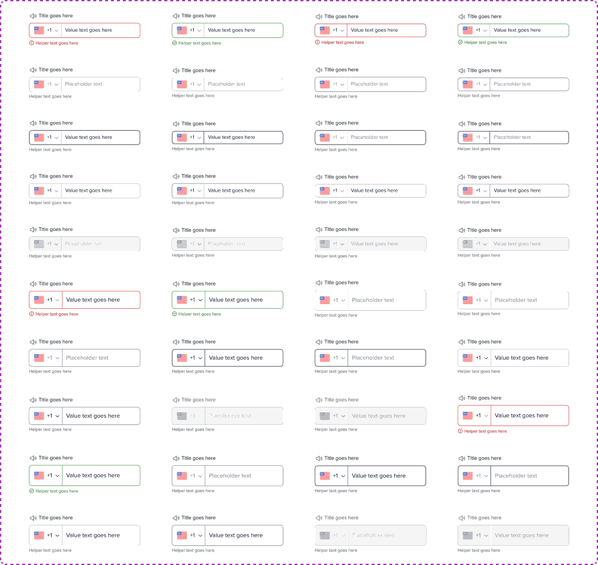
Input fields are fundamental for user interaction, enabling data entry in forms, searches, and other inputs. Our input components are designed to be accessible, scalable, and consistent across all platforms.
Components
- Type: Text, Password, Email, Number, Search
- Size: Large (40px), Medium (32px), Small (24px), X-Small (22px)
- State: Default, Focus, Error, Success, Disabled
- Disabled Switch: Toggle to enable/disable input fields
- Label Position: Top, Left, Floating Label
- Country Code: Dropdown for phone number inputs
- Icon Support: Left & Right icons (FontAwesome embedded)
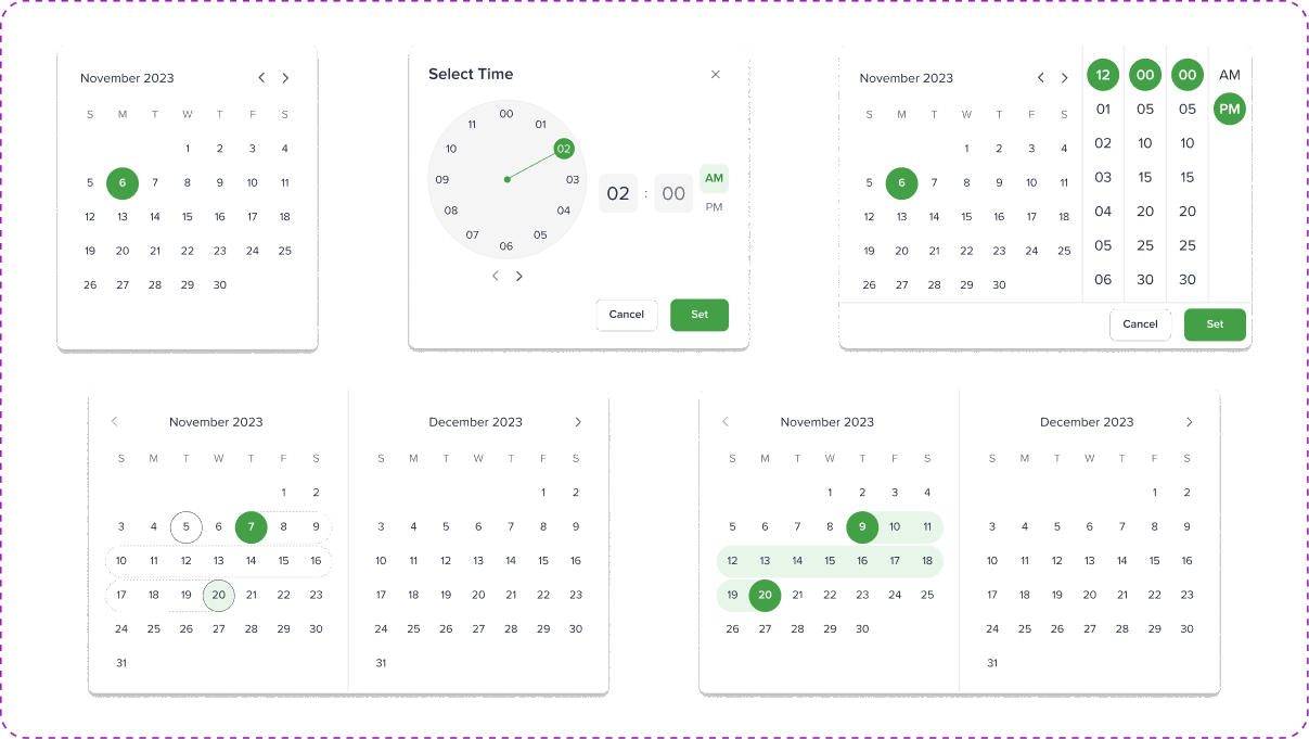
Selection
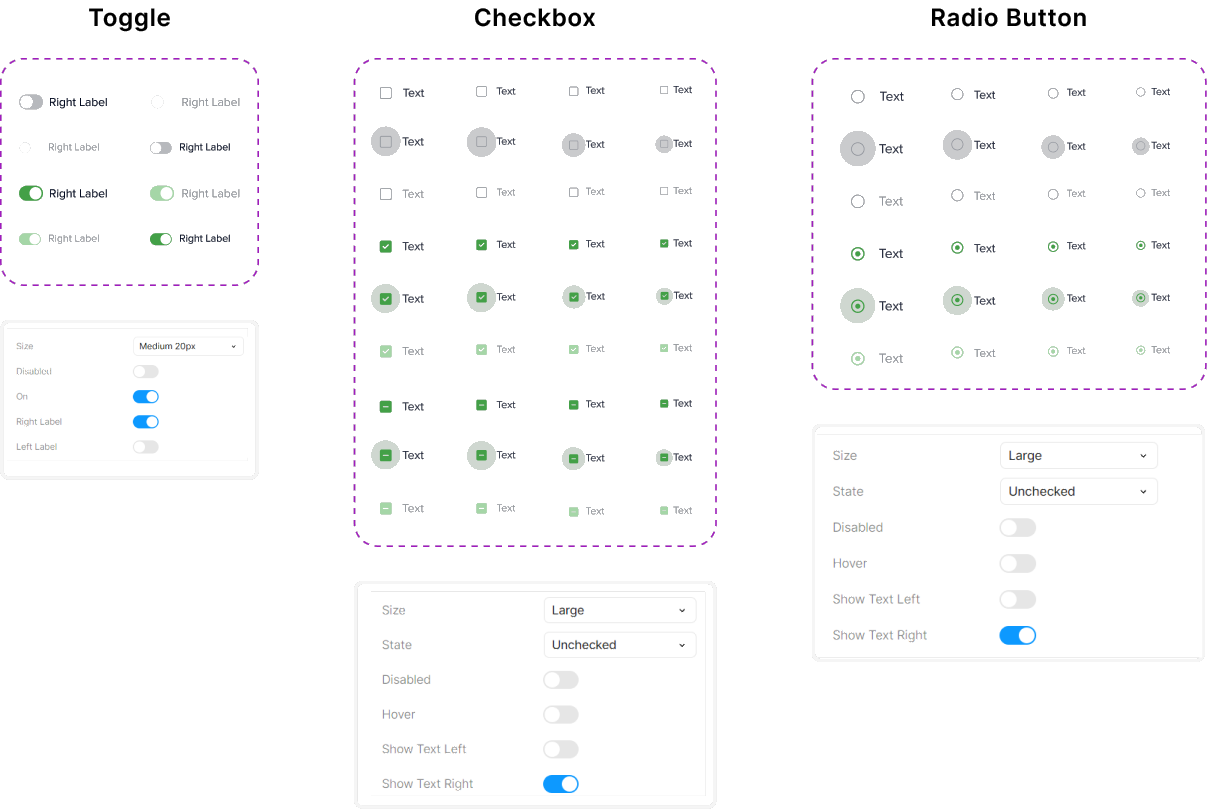
Selection components allow users to make single or multiple choices in forms and interfaces. These elements are designed for clarity, accessibility, and ease of use across different input scenarios.
Date Picker
Navigation
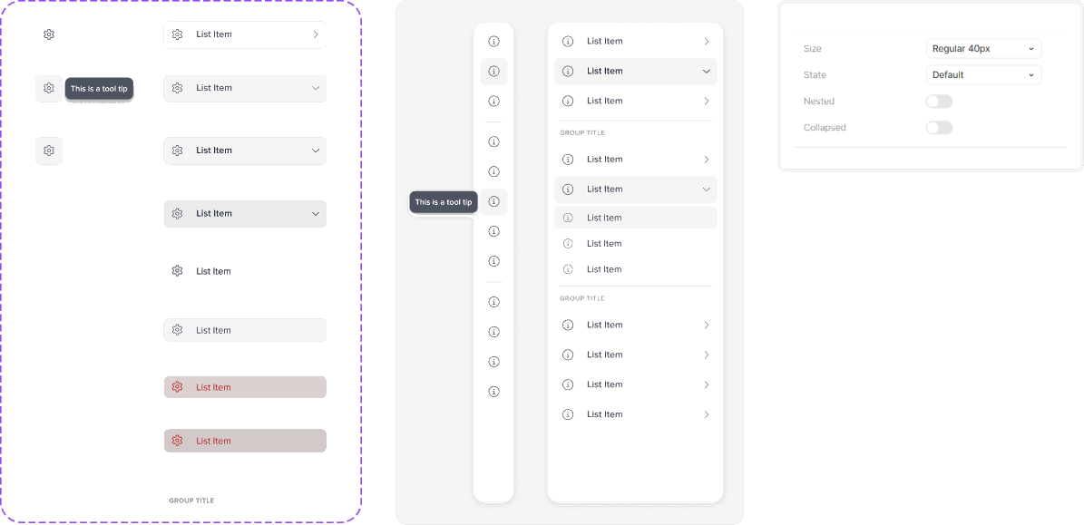
Navigation plays a critical role in guiding users seamlessly through the interface. Our navigation system is designed to be consistent, scalable, and accessible across different screen sizes and platforms.
Components
- Types: Top Navigation, Side Navigation, Breadcrumbs, Tabs
- Icon Support: FontAwesome embedded for icons in menus
- Dropdown Menus: Supports nested items for hierarchical navigation
Side Navigation
A collapsible vertical menu for easy access to primary sections.
Tabs
A compact way to switch between related content sections seamlessly.

Breadcrumbs
A hierarchical trail that helps users track their navigation path.

Data Display
The Data Display components are designed to present information in a clear, structured, and visually engaging way. These elements help users quickly interpret and analyze data across dashboards and interfaces.
Components
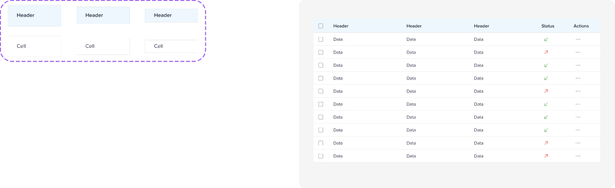
- Tables – Organized data with sorting, filtering, and pagination.
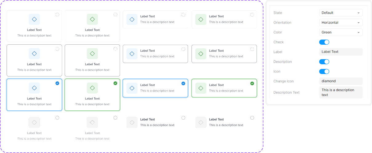
- Cards – Compact containers for key information and actions.
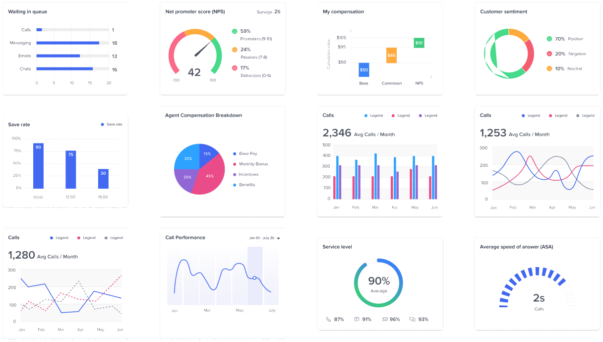
- Charts & Graphs – Visual representation of data trends.
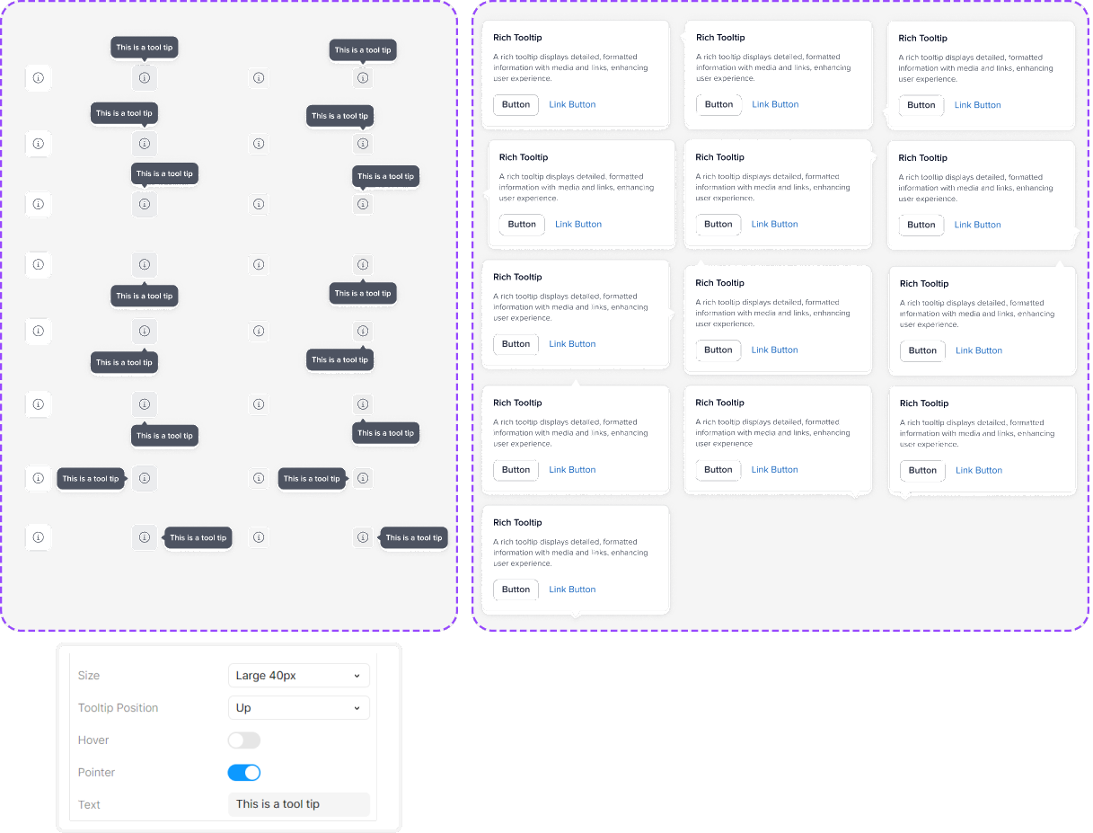
- Tooltips & Popovers – Contextual hints for additional details.
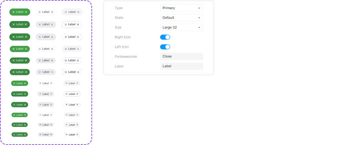
- Badges & Tags – Status indicators for categorization and labeling.
Table
Display structured data with sorting, filtering, and pagination.
Card
Present key information in a compact, interactive format.
Charts
Visually represent data trends for quick insights.
Tooltips
Simple hover-based hints with the option to add a directional pointer on all sides.
Rich Tooltips
Enhanced tooltips with icons, images, or extra details, supporting directional pointers on all sides.
Badges
Small visual indicators used for status, notifications, or categorization.
Feedback & Alerts
Feedback and alert components provide real-time user responses, ensuring clarity in actions, errors, and system statuses. Designed for accessibility and consistency, these components improve user awareness and engagement.
Components
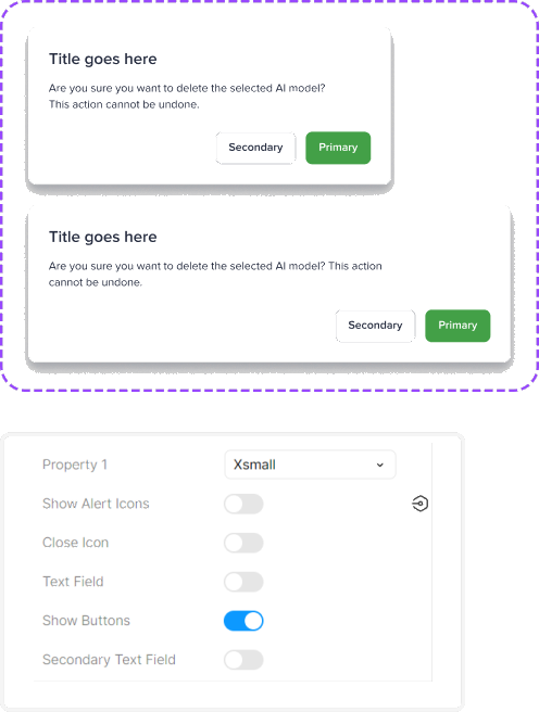
- Modals & Dialogs – Focused pop-ups for confirmations and actions.
- Toasts & Notifications – Subtle, time-based alerts for quick feedback.
- Loaders & Spinners – Indicate ongoing processes or system responses.
- Alerts & Banners – Persistent messages for warnings, errors, or success states.
Modals & Dialogs
Focused overlays that interrupt the flow to confirm an action or collect input.
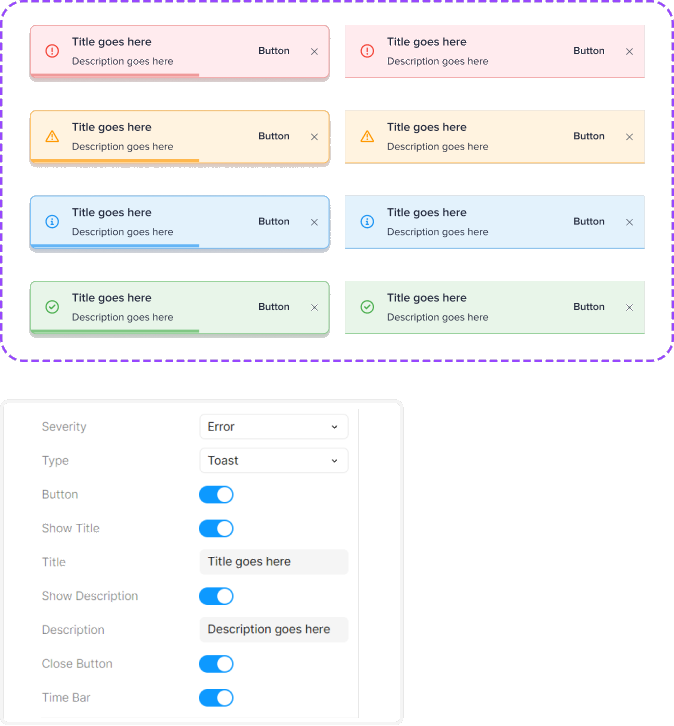
Toasts
Brief, self-dismissing messages confirming the result of an action.
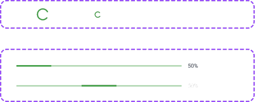
Loader & Spinners
Indicate ongoing processes or system activity with animated visuals.
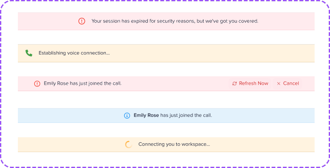
Alerts
Embedded messages within content to highlight important information or status updates.
Documentation
To ensure scalability and consistency, the design system includes clear documentation and a contribution model for teams. Standardized design-engineering handoff processes and version control help maintain a seamless workflow.
Phase 3: Testing, Implementation & Adoption
What we learned:
This phase focused on validating the design system’s usability, accessibility, and implementation to ensure seamless adoption across teams. Testing and real-world integration provided insights into how well the system supports efficiency and consistency.
Activities conducted:
- Usability Testing
- Accessibility Audits
- Developer Handoff & Implementation
- Team Training & Adoption
See the detailed process
Validation
To ensure the design system is intuitive and efficient, usability testing was conducted with designers, developers, and end-users. The goal was to validate the ease of use, adaptability, and effectiveness of components across different workflows.
Usability Testing
Key Focus Areas
- Component Clarity: Ensuring users easily understand and interact with UI elements.
- Efficiency in Workflow: Measuring how quickly teams can implement and use components.
- Error Handling & Edge Cases: Identifying usability gaps and friction points.
- ApproachModerated video call Session & screen sharing
- LocationWorkplace
- Length60-120 minutes
- Participants4 users


Tasks & Scenarios
Participants were asked to complete tasks reflecting real-world usage, including:
Designers
- Apply design tokens (e.g., color, typography) within UI components.
- Build common UI patterns (buttons, forms, navigation) using the component library.
- Customize components for specific product needs.
Key Findings & Insights
- Needed clearer naming conventions for components.
- Requested more flexible customization options for buttons and forms.
- Improved documentation on component variations helped reduce confusion.
Developers
- Implement a button component from the design system into a React/Angular project.
- Use design tokens from the system to apply styling.
- Modify UI elements based on different states (hover, focus, disabled)
Key Findings & Insights
- Streamlined design-to-code handoff reduced friction.
- Some developers struggled with component states due to missing examples.
- Improved token integration guidelines made adoption easier.
Iteration & Fixes
Based on usability feedback, we made the following improvements:
- Clearer component organization & naming in Figma.
- Expanded documentation with more examples & usage guidelines.
- Refined component states & interactions for better usability.
- Enhanced design tokens & theming flexibility for developers.
Accessibility Audits an Inclusive Design System
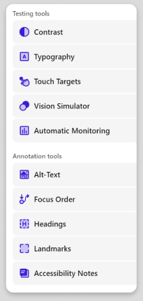
We conducted WCAG 2.1 AA audits using the Stark plugin to validate accessibility compliance.
- Color & Contrast: Improved button and text contrast for readability.
- Form & Validation Improvements: Clear error states and accessible labels.
Outcome
Achieved WCAG compliance, enhanced usability, and set accessibility guidelines for future development.
Developer Handoff Implementation
To ensure a seamless transition from design to development, we established a structured handoff process using Figma and developer tools for efficient implementation.
- Figma Component Library
- Documentation & Guidelines
- Documentation & Guidelines
Outcome
Enabled faster development cycles, ensured design consistency, and reduced UI discrepancies between design and code.
Team Training & Adoption
To ensure seamless adoption, we conducted training sessions and documentation handoff for designers and developers.
Workshops & Demos
Live sessions to guide teams on using the design system.
Comprehensive Documentation
Clear guidelines for component usage and best practices.
Collaboration with Developers
Ensured smooth integration and feedback loops.
Feedback & Iteration
Continuous refinement based on team input.


Outcome
Improved system adoption, design consistency, and cross-team efficiency.
Conclusion
The design system streamlined workflows, improved consistency, and enhanced collaboration between designers and developers.

Key Takeaways
- Efficiency: Faster design-to-development handoff reduced inconsistencies.
- Scalability: A flexible, reusable system adaptable to future needs.
- Adoption: Teams successfully integrated and utilized the design system.

Future Plan
- Expand Component Library – Introduce more patterns and variations.
- Enhance Accessibility – Continuous audits and improvements.
- Automate Design Tokens – Improve Figma-to-code workflows.
- Regular Maintenance & Governance – Keep the system evolving with user needs.

 LinkedIn
 Behance